29 September 2014

My top social picks of the #RyderCup

One long term effect of working at the Commonwealth Games is that I now find myself paying much more attention to big sporting events than I would have in the past. Pre-Glasgow 2014 I wouldn't have batted an eyelid at the World Cup, and I definitely wouldn't know what Fourballs was. 

As it happens, the Ryder Cup has just finished at Gleneagles (in my Scottish homeland!) and I've been paying attention to the action. I won't say close attention as I still can't bring myself to watch sport for hours on end on TV, but I have been following both teams and the main Ryder Cup account activity across their Facebook & Twitter channels. 

According to The Drum the Ryder Cup saw its highest ever online traffic after receiving 162,000 social mentions in the last week. The fans talking about the competition on social media were certainly enjoying what they were watching, with 79% of social mentions being positive. The top hashtags people used were #rydercup, #rydercup2014, #golf, #USA and finally #europe.

I have to say that I think Team Europe had the more polished social media strategy with behind-the-scenes photographs, informative score info-graphics and witty captions - whereas the USA's was a little bit cheesy with the fake movie posters and semi political campaign graphics.  

Take a look below to see some of my favourite posts from the past week, the last one is sure to give you nightmares!


Thanks for reading! Melissa x 

22 September 2014

Musical theatre: poster design tips!

I've been involved with musical theatre groups for around 10 years now - which is a little bit scary to think as that time has flown by! I started out with ICE (Independent Community Entertainment) and Lanark Panto Club, and for the last couple of years I've been part of LAMS (Lanark Amateur Musical Society) as part of the cast and a committee member. 

With posters being one of the main methods of advertising an amateur production, it's important that they look good enough to pull in the punters! I know that a lot of community groups don't have enough budget to pay designers to produce advertising materials, so most of the time it's someone in the cast/committee that ends up creating them. 

It can be hard to know where to start designing a poster for a performance, with the amount of information you need to fit on (dates, times, prices, rights etc) and any brand guidelines linked to the actual show. (logo, graphics etc)

As a little helper to other amateur dramatics groups out there, I've pulled together some tips for creating posters and a A3 layout template that might be of use. (see below design tips)


Design tips

1. Beware of high contrast gradients or gradients that use more than two colours. These can look quite dated. Keep gradients subtle and stick to harmonious colours not too far apart on the colour wheel. For example white/grey, orange/yellow, purple/blue. 

2. Just say no...to Wordart. Over fussy text with too many effects (3D, bevel, gradient, shadow) is another way to make posters look dated. If you want to make your text stand out try using a free font from a website like dafont.com.  

3. If you're going to include photographs in your poster make sure to crop the edges carefully - organic forms like hair can be especially tricky to make look neat and professional. 

4. There might be a a lot of elements in your poster, so make sure the important details stand out by making them easy to read and in the right place. (see guide below!) The most important details are probably the show name, dates, location, price and how to get tickets. 

5. Don't steal images from Google! It can be tempting to copy and paste images you need from Google, but it's actually illegal. A great site for royalty free images is sxc.hu. 

6. Always place text on a solid or semi-solid colour background so it's legible. If you need to place it over an image try adding a low opacity shape behind it. 

7. As we tend to read from top to bottom, left to right, it makes sense lay your poster out so the most important details are easy for people to spot. Although, rules are made to be broken so sometimes this layout can be moved around if the visual idea requires it. 

Example A3 poster layout 


Some good examples


If you're looking for someone to design your poster for a low cost please feel free to send me an email to melissareilly3@gmail.com :) 

Thanks for reading, Melissa x
12 September 2014

"Rooted in the community"

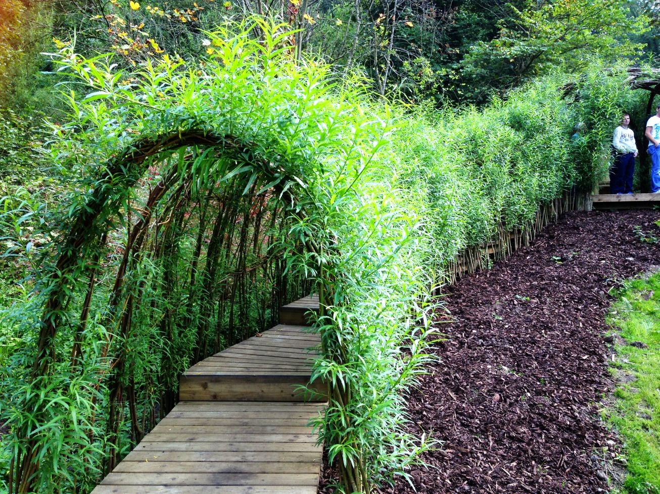
If you go down to the woods today, you'll find something a little bit different in New Lanark! In the continued development of the World Heritage Site on Lanark's doorstep, an exciting new project just been completed. 


In an area of New Lanark which I mostly remember as being a grassy hill, there is now a fantastic facility for families to enjoy: the Clearburn Picnic & Play Area. Walking through the park it's hard to know where to look, as it seems around every bend of the path there is something new for the kids to enjoy. From a 'Bug B&B' and a 'Secret Stage', to my personal favourite the 'Swirling Willow' and 'Once upon a time' story chair. The ingenious design of the play area makes it appear to be part of the landscape, and not just plonked down like other metal and plastic play parks I've seen so many of. The wooden texture and organic forms (like toadstool seats!) of the play area have a real fairy tale feel - and this is only enhanced by the hazy sun filtering through the trees surrounding the park.


There was no ribbon in sight to open the park, instead Willie Macleod, head of the New Lanark Board of Trustees cut a piece of scarlet New Lanark Wool (produced in one of the on site historic mills, don't you know?) to mark the opening of the park. 


Eagerly awaiting the wool to fall were children from local schools who had been involved in the development of the Clearburn Nature Trail. To the sound of applause from parents & on-lookers they formed, what can be called no less than an enthusiastic stampede, over the bridge then shot off in every direction possible to explore their new surroundings. I was slightly jealous that I couldn't join in & hang out on 'Monkey Mayhem', but as a big person I was privy to a bucksfizz and a New Lanark ice cream canape, so I can't complain too much. 

If you live in Lanark or the surrounding areas I'd definitely recommend packing a picnic basket and heading down to Clearburn for the day. Here's how to get there!

Take a peek at the different features of the play area...


Clearburn Picnic & Play Area has been generously supported by The Big Lottery Fund and The Clyde and Avon Valley Landscape Partnership. The project has been developed in collaboration with the local community and schools. 

Keep an eye out for more lifestyle/event posts from The Creative Frontier! 

Follow me on Twitter @_Melissa247https://twitter.com/_Melissa247

8 September 2014

Greetings from...America!

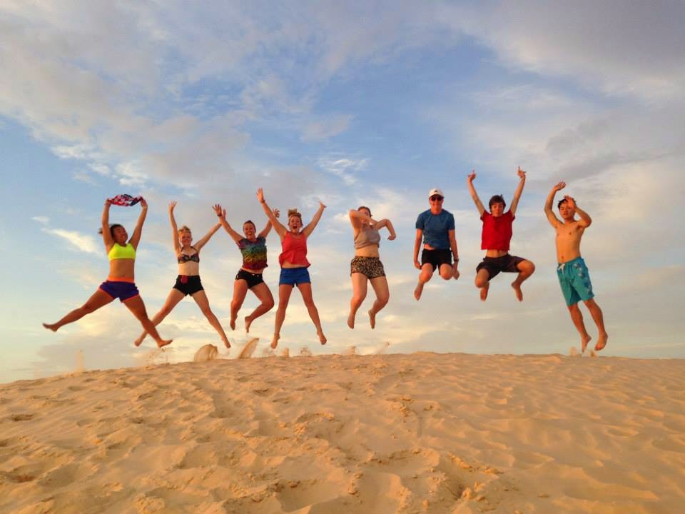
The jet lag is just about wearing off, and I'm becoming accustomed to sleeping in a proper bed again (who knew the divine powers of a mattress?) since touching down in Glasgow early on Thursday morning after an amazing three weeks in the USA. Myself and 7 other twenty-somethings from around the world journeyed from New York to Los Angeles with trekamerica on the company's famous 'Southern Sun' trip. Whilst I was holding up the Scottish contingent on my own, we had Angela from New Zealand, Roy from Korea and 5 other gals/guys from England. Leading the group was our amazing tour guide Becky, from Washington State. It was such an incredible experience, I'm sure we'll all remember it for years to come. 

After sifting through all of my souvenirs and random artifacts I picked up along the way, I discovered I had quite the postcard collection going on. Whilst I didn't manage to raid a gift shop in each of the 18 states we passed through, the ones I did manage to get are from some of my favourite states/cities we visited: Texas, New Orleans, Las Vegas and Washington D.C.

I love the down right cheesy graphics on some of the postcards. They remind me of the idealistic America I had in my mind before setting off on the trip: big, brash, bold, colourful and a little bit retro. 

For your viewing pleasure, and from a graphic design point of view here's a look at the different styles of postcards you can pick up from sea to shining sea. 


Do you have a favourite postcard? Mine could be glitter-tastic Vegas!

Thanks for reading, Melissa.

Follow me on twitter @_Melissa247

Related Posts Plugin for WordPress, Blogger...