17 November 2014

Roundup of this year's Christmas Adverts

In the words of Michael McIntye, "Are you feeling Christmassy yet?" I'm certainly in the mood for a mince pie after looking through some of this year's most popular Christmas ads from the nation's biggest food & gift retailers. 

From penguins to the post office, it's been fascinating looking at how some retailers have went all out down the emotional route to drive shares and others have focused on showcasing the quality and prices of their festive offerings. 

Maybe I'm a big softie, but my two favourite ads are the ones from John Lewis and Sainsbury's that tell a real story. Kudos also goes to Waitrose for their charitable song-download donations, and to Aldi for giving me a serious craving for a smoked salmon voulevant. 


Do you have a favourite from the ads below? Tweet me @_Melissa247 or leave a comment!


The Post Office: "Get Christmas All Wrapped up"
For the first time in around 5 years, the Post Office have released a Christmas advert to encourage more customers to post through their outlets - with the ad highlighting benefits like reduced postage for small parcels and guaranteed Christmas delivery right up until 23rd December. The quirky advert stars a range of celebs including: comedian Robert Webb, singer Pixie Lott, Downton Abbey’s Jim Carter, actress Amanda Holden and chef Gino D’Acampo.

Views by 17.11.14: 2,386
Positives: Not too soppy. Makes brown parcel tape and recorded delivery fun & memorable.
Negatives: Webb's 'Wonka-esque' character appears to have been popping LSD like chocolate coins.  
Hashtag: #AllWrappedUp


Waitrose: "The Gingerbread Stall"
This advert tells the story of a girl who is put in charge of making delicious gingerbread biscuits for her class’s stall at the school Christmas fair. Although not very memorable to begin with, the advert has a few moments that make you smile - like the naughty dog munching a batch of the gingerbread biscuits. In true Christmas spirit, the soundtrack to the advert is a cover of Dolly Parton's 'Try' and was created using voices of members of the public, who took part in Waitrose's Donate Your Voice campaign in October. All profits from the sale of the track are being donated to charity which I think is a lovely touch. You can download it on iTunes and Google Play. 

Views by 17.11.14: 479,422
Positives: Nice range of associated media including Gingerbread recipes, behind the scenes videos and in-store gingerbread icing stations. YUM!
Negatives: Not immediatly as memorable or shareable as other ads until you know the story behind the advert & the charity aspect. 
Hashtag: #DonateYourVoice


Marks and Spencer "Follow the Fairies"
Marks and Spencer have cleverly created the two characters of Magic and Sparkle the fairies in this year's polished Christmas advert. Whilst I don't think the actual advert itself is anything to get too excited about, the 'Magic and Sparkle' concept capitalises on the reputation of M&S being a bit of a "treat" and "special" shopping destination. Another brilliant element of the campaign is the @thetwofairies twitter account which tweets from the perspective of both the fairies, and follows them as they spread kindness throughout the UK meeting people young & old and leaving them special gifts. This appears to have captured the imagination of kids, with lots of mums tweeting their photos & messages for the fairies.

Views by 17.11.14: 3,031,595 (third place!) 
Positives: Great online engagement with the Christmas-dinner-buying target market - mums!
Negatives: The actual TV advert is a little bit long and doesn't show all the amazing engagement with the fairies across the UK. 
Hashtag: #FollowtheFairies


John Lewis 'Monty the Penguin'
John Lewis' advert tells the story of a little boy, Sam, and his best friend Monty the Penguin. "It's a tale of love, friendship and giving someone the gift they've been dreaming of this Christmas." Like last year's Bear & Hare advert, John Lewis are masters at creating characters that make you go 'awww' and Monty is no exception. Admittedly, I did almost cry watching this advert the first time - but I'm not sure if it's made me any more likely to shop in John Lewis - probably because I don't have a child who will implode if they don't get one of the sold-out Monty toys. 

Views by 17.11.14: 15,667,803 (leading the way!)
Positives: Funny & engaging twitter accounts for both penguins Monty & Mabel....they even flirt! 
Negatives: Christmas commercialism gone a bit mad with a plethora of Monty merchandise....penguin cufflinks anyone?
Hashtag: #MontyThePenguin


Sainsbury's 'Christmas is for Sharing'
Quite possibly my favourite of the lot, Sainsbury's advert is a 3 minute long tribute to real events from 100 years ago. Made in partnership with The Royal British Legion, it commemorates the extraordinary events of Christmas Day, 1914, when the guns fell silent and two armies met in no-man’s land, sharing gifts – and even playing football together. The chocolate bar featured in the ad is on sale now at Sainsbury’s. All profits (50p per bar) will go to The Royal British Legion and will benefit armed forces and their families, past and present. A definite tear-jerker, I really love this advert and although it doesn't scream 'buy your christmas shopping at Sainsbury's' it's certainly got people talking about an extremely worthy charity. 

Views by 17.11.14: 9,065,759 (second place!)
Positives: Makes you feel all the feels. Keeps WW1 in our minds during this commemorative year & helps raise money via unique chocolate bar sales. 
Negatives: n/a (maybe I'm biased)
Hashtag: #ChristmasIsForSharing


Debenhams 'Found It!'
Debenhams' advert encourages viewers to "Explore the magic of a Debenhams Christmas as the search begins for your most fabulous festive season yet" Although it shows off a very pretty and festive looking store, I'm struggling to find any real saving grace of the advert as it seems to lack any real emotional story, or actually promote the benefits of shopping at Debenhams compared to other shops this Christmas.

Views by 17.11.14:695,806
Positives: Engaging weekly competition for people who share their #FoundIt selfie with their Debenhams purchase.
Negatives: Advert doesn't stand out at all against it's competitors. It's also confusing as you can't really tell what all the kids are doing running around, and finding the fluffy reindeer at the end is a bit of an anti-climax. 
Hashtag: #FoundIt


Boots #SpecialBecause
This endearing advert from Boots celebrates being together at Christmas, surrounded by the ones you love. It's a nice mix of an emotional story - celebrating the mum at the heart of the family - and successfully showcases the range of special gifts you can pick up at Boots to treat those special to you. 

Views by 17.11.14: 284,342
Positives: Encouraging people to share the love with their #SpecialBecause hashtag pulled together on their website. 
Negatives: Not much, could have a clearer CTA to use the hashtag at the end of the ad. 
Hashtag: #SpecialBecause


Tesco 'Lights On'
Plugs...plugs everywhere! Tesco's Christmas advert shows a range of people getting ready for Christmas, with the help of Tesco of course. This advert doesn't appeal to me too much as it doesn't really convey an emotional story, or highlight any benefits of shopping at Tesco this Christmas. I think their retro 2013 advert was FAR superior!

Views by 17.11.14: 505,377
Positives: Funny characters & relate-able situations (how do lights get tangled EVERY year?)
Negatives: They don't seem to be bothering too much with continuing the adverts engagement, and haven't even tweeted about it in almost a week!
Hashtag: #MakeChristmas


Aldi 'Everyones coming to us this Christmas'
Leaving the tissues behind, Aldi have gone for a light-hearted advert which highlights the trend of Aldi/Lidl's growing popularity and reputation for selling high-quality food at a fraction of the price. Out of all the ads, this is probably the one that's most likely to make you change your mind when deciding where to fork out for the Christmas turkey. Oh and yes, that is Jools Holland at the end! 

Views by 17.11.14: 40,785
Positives: Engaging social media competition where users tell @AldiUK who is joining them for Christmas dinner for a chance to win the food from the advert. 
Negatives: Now I'm hungry....
Hashtag: #AldiChristasAd


Thanks for reading, Melissa x

Jingle bells, jingle bells, jingle all the way.......*damnit!*

3 November 2014

The show must go on! The BIG list of show promotion tips.

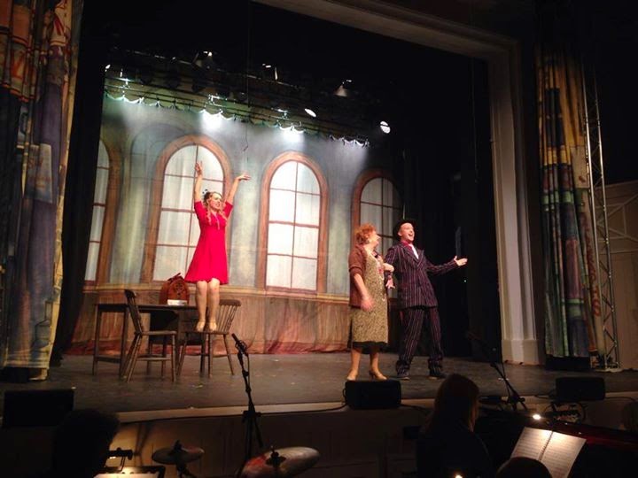
As I mentioned in one of my previous posts I've been involved with musical theatre groups for around 10 years. During this time I've been a cast member, committee member and have helped out backstage. However, one thing stays the same - whenever you're involved with an amateur musical production there is always a huge need for the cast (and everyone else involved) to promote the show, and drive ticket sales. Without the huge budget that many West End productions have, this can sometimes be really tough, and pretty stressful for those at the heart of the organisation. 

That's where this post comes in - it does exactly what it says on the tin. It's a big quick-fire list of ways to promote your amateur theatre production. Most of them are free, and a number of them are fairly simple to implement and can result in a huge boost in awareness (and ticket sales yahoo!)

Here we go...

1. Have your posters designed well and put them up in local, high traffic areas at least one month before the performance. Tip: offer shops A4 or A3 and they're more likely to put one up depending on what they can fit in their window. 

2. Keep the visual style of your posters consistent across any other advertising: social, web, press adverts etc. 

3. Create a Facebook event for your performance and encourage cast members to 'invite' all their friends/family. 

4. Submit your event to any local 'news' sites, a really good one in Lanark is Lanark Life. 


5. Submit for free to WOW247 

6. Add information about your show, images, videos & press releases to your local S1 page - here's S1Lanark.

7. Submit your events to you local 'whatson_____' website, they send out weekly newsletters! Here's Whatsonlanarkshire.

8. Submit details of your event to amdram.co.uk - a site specifically dedicated to all things amateur dramatics!

9. If your group is a member of NODA, make sure you're listed on their website's What's On page.  

10. Write a press release for your performance giving background to the show, key details, a bit of background about your group and any other interesting facts. Send it to local media, bloggers and the websites I mentioned above!

11. If you have budget available consider advertising in your local paper. They will tend to offer discounts if you take multiple ads, so consider placing a series of ads in the run up to the performance. 


12. If the venue of your performance has a website make sure your event has a listing on it. If they can share it on their social media channels - even better!

13. Advertise in other local production's programmes to attract a captive audience who you know should be interested in other shows. 


14. Get social and set up a Facebook & Twitter channel for your group, if you haven't already! As with point 1, keep all your channels branded and change your Facebook cover image to promote the show. 

15. Encourage cast members to change their profile picture to a graphic advertising the show. 

16. Consider paying to increase the reach of your Facebook posts or tweets. On Facebook this can be done for as little as £3!

17. Take over your local high street with a media day! Dress up in costumes from your show to get noticed, hand out flyers and if possible get the soundtrack playing on a boombox or sound system. 


18. Invite local media/bloggers along to your dress rehearsal to photograph & write up a review of the show ahead of 'curtains up'. 


19. Put on your directors hat and create a short promotional video. Capture footage of rehearsals, talk to the cast & production team!


20. Share 'behind the scenes' photos of rehearsals, costumes, set with your social media audience to continually build awareness of the show and give people a little teaser of what to expect. 


21. Encourage people who see your show to leave a review or wall post on your Facebook page, or gather comments via a guest book. You can then share these socially the next day to continue to drive ticket sales throughout show time!


22. Make sure details of your performance are on the homepage of your website!

23. Advertise your event with posters & flyers on tables at any fundraising events your group holds. A good idea is to have a simple 'What's on' A6 flyer that you can easily update & print in black and white for each different fundraiser or gathering. 

Phew, that turned out to be quite a list - and I'm sure I've probably forgotten something. If you can think of anything that's worked for you please comment below!

Thanks for reading, 
Melissa.  

PS. Lanark Amateur Musical Society's next production is Our House in March 2015 :) 

27 October 2014

Fonts à la française!

A couple of weeks ago I came home from a rather lovely holiday in Nice, South of France. We had a super-handy apartment right on the promenade, and the weather was much nicer than expected for early October. Most importantly, copious amounts of red wine, cheese and bread were eaten. C'est la vie!

I love looking at the different styles of signage when you're on holiday. From hand painted shop signs tucked away down little alleys, to neon signs blinking down the main street. They always seem to look more interesting, colourful and personable to the company/people who own the business than the usual signs we see on every British high street. 

During our walks throughout the Old & New town of Nice, I tried to snap some of my favourite examples of signage on the shops, restaurants and official buildings. 

It wasn't too clear at the time, but looking back at the photos below there seem to be two distinct 'french' styles in Nice. 

1. The first style is quite thin, italic, cursive, in a solid colour - think Monotype Corvosia. 

2. The second, and more prominent style uses block capitals and wide kerning with a solid shadow, usually white or lighter than the font colour. 

Across all examples there appears to be a common family of colours used which are all warm/earthly: red, burgandy, brown, cream, black, yellow...


So, if you're working on a design project which requires a french touch, here are some fonts which might help you out: 

Click to download!


Thanks for reading, Melissa x


29 September 2014

My top social picks of the #RyderCup

One long term effect of working at the Commonwealth Games is that I now find myself paying much more attention to big sporting events than I would have in the past. Pre-Glasgow 2014 I wouldn't have batted an eyelid at the World Cup, and I definitely wouldn't know what Fourballs was. 

As it happens, the Ryder Cup has just finished at Gleneagles (in my Scottish homeland!) and I've been paying attention to the action. I won't say close attention as I still can't bring myself to watch sport for hours on end on TV, but I have been following both teams and the main Ryder Cup account activity across their Facebook & Twitter channels. 

According to The Drum the Ryder Cup saw its highest ever online traffic after receiving 162,000 social mentions in the last week. The fans talking about the competition on social media were certainly enjoying what they were watching, with 79% of social mentions being positive. The top hashtags people used were #rydercup, #rydercup2014, #golf, #USA and finally #europe.

I have to say that I think Team Europe had the more polished social media strategy with behind-the-scenes photographs, informative score info-graphics and witty captions - whereas the USA's was a little bit cheesy with the fake movie posters and semi political campaign graphics.  

Take a look below to see some of my favourite posts from the past week, the last one is sure to give you nightmares!


Thanks for reading! Melissa x 

22 September 2014

Musical theatre: poster design tips!

I've been involved with musical theatre groups for around 10 years now - which is a little bit scary to think as that time has flown by! I started out with ICE (Independent Community Entertainment) and Lanark Panto Club, and for the last couple of years I've been part of LAMS (Lanark Amateur Musical Society) as part of the cast and a committee member. 

With posters being one of the main methods of advertising an amateur production, it's important that they look good enough to pull in the punters! I know that a lot of community groups don't have enough budget to pay designers to produce advertising materials, so most of the time it's someone in the cast/committee that ends up creating them. 

It can be hard to know where to start designing a poster for a performance, with the amount of information you need to fit on (dates, times, prices, rights etc) and any brand guidelines linked to the actual show. (logo, graphics etc)

As a little helper to other amateur dramatics groups out there, I've pulled together some tips for creating posters and a A3 layout template that might be of use. (see below design tips)


Design tips

1. Beware of high contrast gradients or gradients that use more than two colours. These can look quite dated. Keep gradients subtle and stick to harmonious colours not too far apart on the colour wheel. For example white/grey, orange/yellow, purple/blue. 

2. Just say no...to Wordart. Over fussy text with too many effects (3D, bevel, gradient, shadow) is another way to make posters look dated. If you want to make your text stand out try using a free font from a website like dafont.com.  

3. If you're going to include photographs in your poster make sure to crop the edges carefully - organic forms like hair can be especially tricky to make look neat and professional. 

4. There might be a a lot of elements in your poster, so make sure the important details stand out by making them easy to read and in the right place. (see guide below!) The most important details are probably the show name, dates, location, price and how to get tickets. 

5. Don't steal images from Google! It can be tempting to copy and paste images you need from Google, but it's actually illegal. A great site for royalty free images is sxc.hu. 

6. Always place text on a solid or semi-solid colour background so it's legible. If you need to place it over an image try adding a low opacity shape behind it. 

7. As we tend to read from top to bottom, left to right, it makes sense lay your poster out so the most important details are easy for people to spot. Although, rules are made to be broken so sometimes this layout can be moved around if the visual idea requires it. 

Example A3 poster layout 


Some good examples


If you're looking for someone to design your poster for a low cost please feel free to send me an email to melissareilly3@gmail.com :) 

Thanks for reading, Melissa x

12 September 2014

"Rooted in the community"

If you go down to the woods today, you'll find something a little bit different in New Lanark! In the continued development of the World Heritage Site on Lanark's doorstep, an exciting new project just been completed. 


In an area of New Lanark which I mostly remember as being a grassy hill, there is now a fantastic facility for families to enjoy: the Clearburn Picnic & Play Area. Walking through the park it's hard to know where to look, as it seems around every bend of the path there is something new for the kids to enjoy. From a 'Bug B&B' and a 'Secret Stage', to my personal favourite the 'Swirling Willow' and 'Once upon a time' story chair. The ingenious design of the play area makes it appear to be part of the landscape, and not just plonked down like other metal and plastic play parks I've seen so many of. The wooden texture and organic forms (like toadstool seats!) of the play area have a real fairy tale feel - and this is only enhanced by the hazy sun filtering through the trees surrounding the park.


There was no ribbon in sight to open the park, instead Willie Macleod, head of the New Lanark Board of Trustees cut a piece of scarlet New Lanark Wool (produced in one of the on site historic mills, don't you know?) to mark the opening of the park. 


Eagerly awaiting the wool to fall were children from local schools who had been involved in the development of the Clearburn Nature Trail. To the sound of applause from parents & on-lookers they formed, what can be called no less than an enthusiastic stampede, over the bridge then shot off in every direction possible to explore their new surroundings. I was slightly jealous that I couldn't join in & hang out on 'Monkey Mayhem', but as a big person I was privy to a bucksfizz and a New Lanark ice cream canape, so I can't complain too much. 

If you live in Lanark or the surrounding areas I'd definitely recommend packing a picnic basket and heading down to Clearburn for the day. Here's how to get there!

Take a peek at the different features of the play area...


Clearburn Picnic & Play Area has been generously supported by The Big Lottery Fund and The Clyde and Avon Valley Landscape Partnership. The project has been developed in collaboration with the local community and schools. 

Keep an eye out for more lifestyle/event posts from The Creative Frontier! 

Follow me on Twitter @_Melissa247https://twitter.com/_Melissa247

8 September 2014

Greetings from...America!

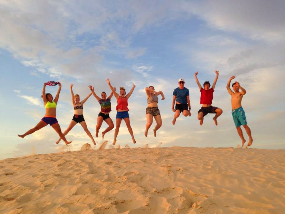
The jet lag is just about wearing off, and I'm becoming accustomed to sleeping in a proper bed again (who knew the divine powers of a mattress?) since touching down in Glasgow early on Thursday morning after an amazing three weeks in the USA. Myself and 7 other twenty-somethings from around the world journeyed from New York to Los Angeles with trekamerica on the company's famous 'Southern Sun' trip. Whilst I was holding up the Scottish contingent on my own, we had Angela from New Zealand, Roy from Korea and 5 other gals/guys from England. Leading the group was our amazing tour guide Becky, from Washington State. It was such an incredible experience, I'm sure we'll all remember it for years to come. 

After sifting through all of my souvenirs and random artifacts I picked up along the way, I discovered I had quite the postcard collection going on. Whilst I didn't manage to raid a gift shop in each of the 18 states we passed through, the ones I did manage to get are from some of my favourite states/cities we visited: Texas, New Orleans, Las Vegas and Washington D.C.

I love the down right cheesy graphics on some of the postcards. They remind me of the idealistic America I had in my mind before setting off on the trip: big, brash, bold, colourful and a little bit retro. 

For your viewing pleasure, and from a graphic design point of view here's a look at the different styles of postcards you can pick up from sea to shining sea. 


Do you have a favourite postcard? Mine could be glitter-tastic Vegas!

Thanks for reading, Melissa.

Follow me on twitter @_Melissa247

Related Posts Plugin for WordPress, Blogger...